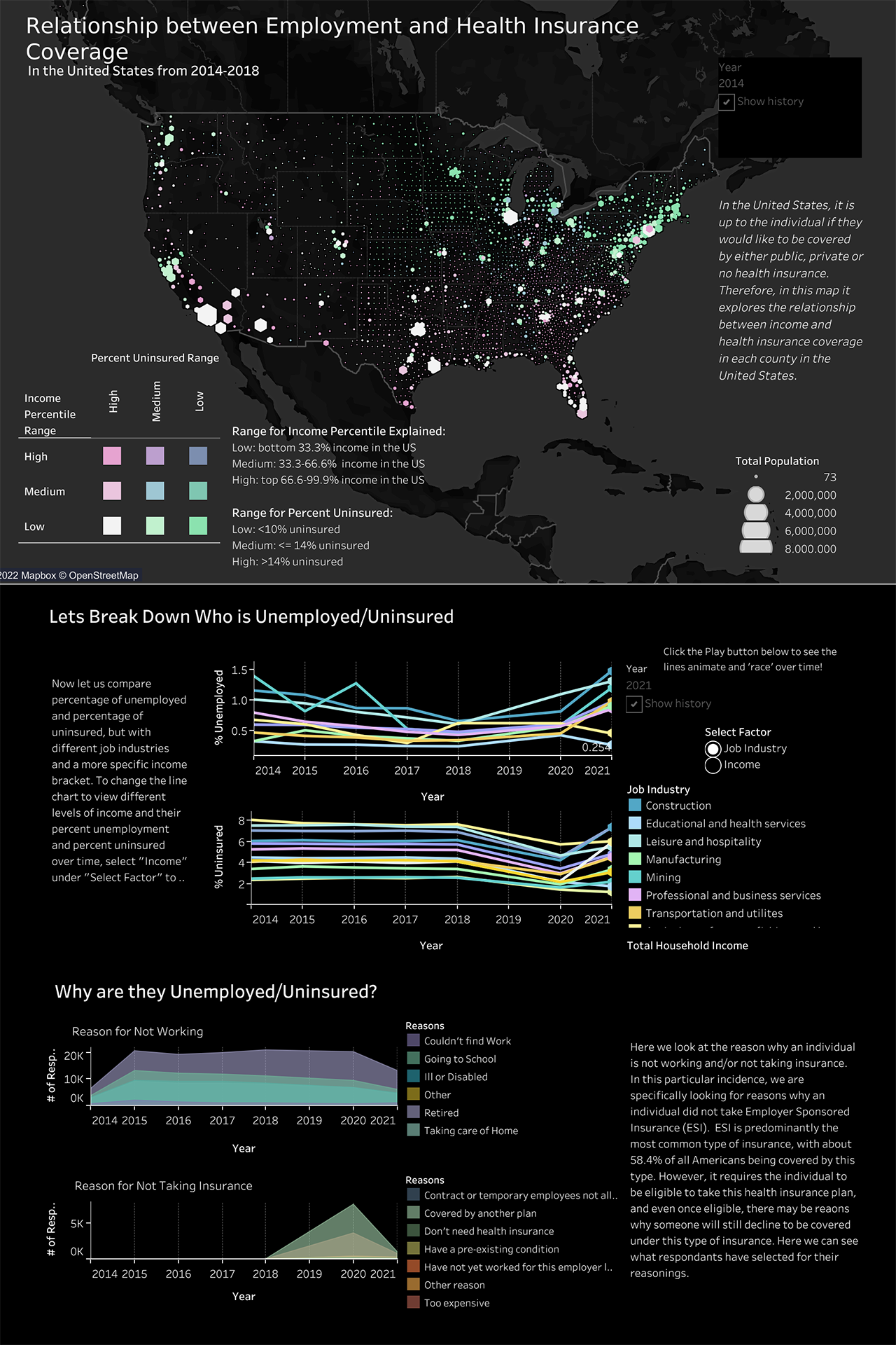
Relationship between Employment and Health Insurance Coverage
The purpose of this piece is to visualize the data
taken from the US Census from years 2014-2018 about employment and
health insurance coverage. I wanted to investigate if there was a
correlation between employment and their health insurance as most
private health insurance is dependant on empolyment. The interactive
dataviz can be accessed here.
Continue reading to learn about the process that went into creating this piece.
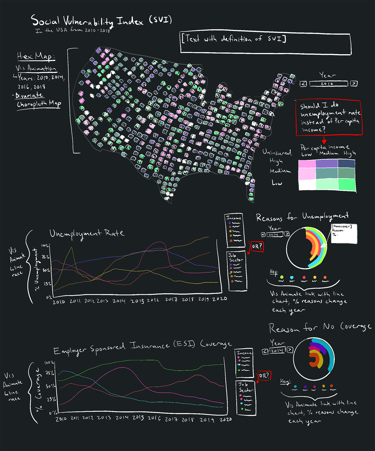
Sketches
After doing some research about what Tableau can create, I drew out some sketches with some interactive components to illustrate the data. I knew that I wanted a hex map that is a bivariate choropleth map that shows two factors relating to each other. Then for the line graphs I wanted to do a line race. One of the challenges was learning Tableau, and cleaning up a large amount of data in Tableau Prep.
